Kortrijk Business Park
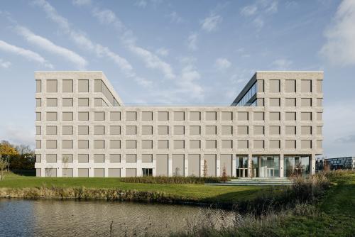
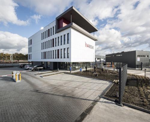
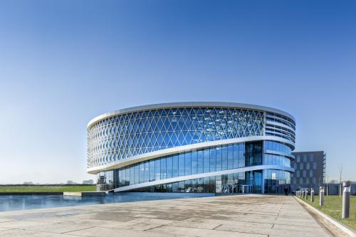
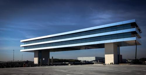
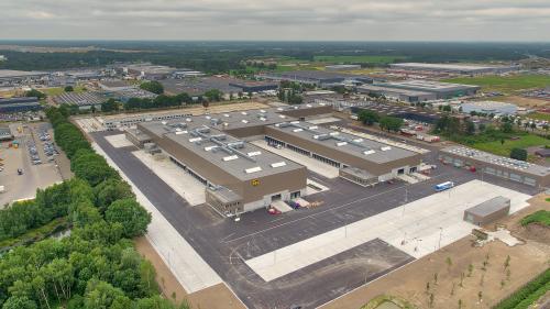
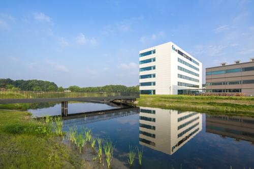
The project developer wanted a new home base on the prestigious Benelux Park in Hoog Kortrijk, the economic heart of the South-West Flanders region. The building is located at the so-called 'head' of the Benelux Park, next to a large pond which collects water from the surrounding area. The design builds on Blauwdruk's master plan. The urban development agency prescribed the outlines and position of the building volume in relation to the pond. The master plan also stipulated that the head of the Benelux Park should continue the green character of the business park, but that the building should not be screened by trees or bushes. It had to be monumental, prestigious and visible from afar in order to mark the beginning of the business park.
Project properties
Topography determines the design
"The design of the building finds its starting point in the sharp difference in height on the site. The building site has a slope of almost three metres, ending in a bend in the pond. To bridge such a difference in level - almost a storey high - you have to either partially bury the building or partially place it on a pedestal. POLO was able to turn what initially appeared to be a tricky issue into an advantage and an all-important feature of the building." Patrick Persoons - POLO project architect
In their design, the architects split the ground floor into a 'level 0A', the ground level on the east side, and a lower 'level 0B' on the west or pond side of the building. The architects then extend the first floor horizontally across the whole building. Another four floors are added on top. This decision results in a generous, double-height floor on the lower level 0B, which accommodates an event space and a restaurant with a terrace overlooking the pond, among other things. Under the building is the car park, spread over two floors. This also follows the slope of the terrain.
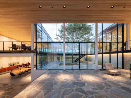
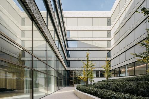
In the middle of the building, the architects spared a green patio measuring 12 x 32 metres. This was laid out by the landscape architects Wirtz. In the patio, the slope of the terrain is visible, so that users and visitors can experience the topography of the terrain in the core of the building. The patio provides light and air and structures the internal operations of the office building. Around the patio, a pleasant circulation space with a view of the greenery is created. The patio divides the building into a north and a south wing, each with its own lift shafts, technology and sanitary facilities. This organisation allows for a flexible layout of the offices to be let. On the west side or the pond side of the building, two storeys have been cut away at the top. Thanks to this intervention, the sunlight reaches the ground level of the patio during summer, and a large terrace with a panoramic view of the landscape is created on the fourth floor.
Subtlety, refinement and detail
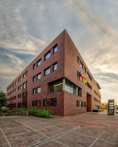
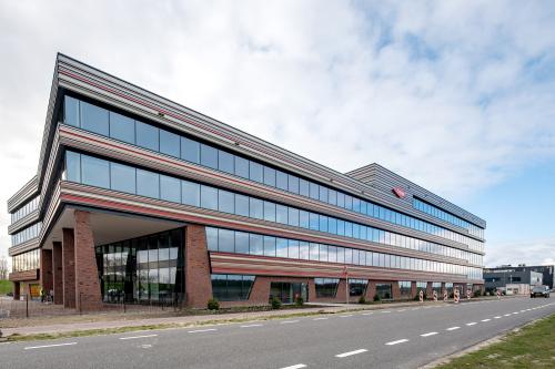
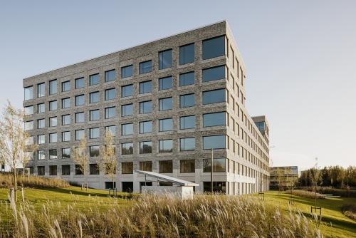
The building, which from afar has a very robust, tough and even almost abstract appearance, changes its appearance as you approach. The robustness gives way to subtlety, refinement and detail. The façade is tightly rhythmised by the window sections. Above the plinth in exposed concrete, the façade is finished with a rough ochre-green brick, while the windows are accentuated with a vertical and horizontal strip of brick masonry in a remarkable claustra bond, in which the bricks are placed at an angle of 75 degrees to each other. The relief in the façade details creates a special play of light and shadow, with constantly changing colour shades. This play of colours is even more effective in the evening, thanks to the built-in lighting.
'Refinement': the word also applies when you enter. The interior finishing of the entrance hall and the central area is high end and majestic. The floors are made of natural stone (Breccia Alba), the walls are finished in 'bookmatched' marble. The ceilings are made of steel grids with acoustic insulation mats, in which openings have been made in strategic places, through which atmospheric lighting enlivens the space. The reception desk is also made of marble, with accents in antique-tinted oak veneer, which gives a warm touch to the whole. A remarkable, sculptural staircase is located in the central common room. The staircase resolves the difference in height of the site and makes the transition from level 0A to 0B with its double-height ceilings. The staircase can be used as a mini-auditorium, for example for company speeches, presentations or, more informally, for taking a break or having a chat. In the communal area and the circulation area around the patio, small, informal meeting furniture of various sizes and shapes is strategically placed. They provide a place for short, informal meetings and gatherings. The meeting modules are made of the same, recurring materials: marble, wood and perforated steel sheet. The steel sheets provide shelter and privacy without completely closing off the modules from the outside world.
The new way of working
POLO also designed the interior of the Vesta offices, which are located on the fifth floor. Here too, the same materials are used as on the ground floor: marble and oak veneer.
"The offices are bathed in a more 'homely' atmosphere. The 'new way of working' is shown to its best advantage here. It is not an office where everyone has their own desk, but where employees work flexibly, depending on their needs and the nature of the work. There are concentration areas where one can isolate oneself in silence, large meeting rooms and more informal work spaces." Tom Huycke - POLO interior architect
Vesta rents out the remaining office space to other companies. These offices are delivered semi-furnished, so that each company can furnish them to its own taste. The various units can be flexibly divided into office spaces of 350 to 2500 m².
Office of the twenty-first century
The client wanted to build the 'office of the 21st century', not only in terms of appearance or way of working, but also in terms of construction method, sustainability and techniques. The entire building is constructed with a column grid of 8.10 x 8.10 metres. That made it interesting to work with the patented C-fast prefab system, which was developed by Cordeel. This system has the advantage that almost no beams are needed. Beam, column and slab form one flat unit.
The floor slabs are simply placed on the columns and walls and anchored with a special threaded rod connection. This allows the building to be simply dismantled after its life cycle. The prefabrication system also made it possible to significantly reduce construction costs.
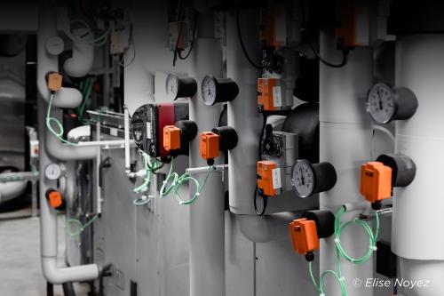
The building is fully 'automated'. Climate ceilings provide heating, cooling and fresh air. Sunshades on the south side prevent it from overheating. Light is monitored throughout the building, including detection. Light intensity and colour adjusts to the intensity and colour of light entering through the windows. Thanks to all these technological tours de force, the building achieves exceptional performance in terms of sustainability and was awarded the BREEAM 'very good' rating.
